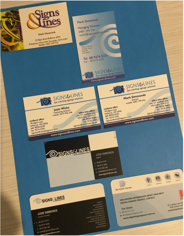
Our intent has always been to portray the company's professionalism through a corporate styling that is visually interesting.
From the top to bottom of the page, the visual evolution is clear - from when we took over the business in 2001 with a greeny, swirly logo, to the five styling manifestations since then.
In 2002 we introduced the ''eye" to visually reinforce our strapline of 'eye-catching signage solutions'. This has stayed with us faithfully ever since and continues to be a key element of our branding.
In 2007 a re-design added a harlequin effect to both sides of the card, which was paired with a simplified 'white-space' design, cleaner ''eye'' logo and new font.
Just recently, in 2016 we have morphed the cards once again to incorporate our S&L Digital Signage division on the reverse of the cards. Our intent is that the Signs & Lines and S&L Digital Signage brands work side by side both logistically and creatively - something like nature's beautifully natural symbiotic relationships!
As some people ponder the questions ''What's in a name?", I wonder "What's in a business card?"
 RSS Feed