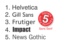
What’s your favourite sans serif font(s) for sign making?
I recently asked this very question to my connections and fellow International Sign Association group members on LinkedIn...
"What’s your favourite sans serif font(s) for sign making?"
Aaron Kirkpatrick - Helvetica Neue Condensed, Futura;
Lisa Havniear - Futura, Helvetica, Frutiger;
Vernit Holder - Impact, Frutiger, Arial, Helvetica, Gill Sans;
Joe Paterson - Optima, Microgramma;
Tomas Pukalski - DIN 1451 Mittelschrift;
Izzie Enwall - Arial, Futura, Impact, Helvetica;
Steve Bowen - Arial Black, Impact, Kabel Black, Machine BT;
Joani Theodore - Helvetica, Impact, Futura, Transport;
Dereck D Cruz - Arial Black, Impact;
Daniel Royer - Trade Gothic;
Jeffrey Thomas - Helvetica;
Marian S - Frutiger.
In summary:
Helvetica came out top with 6 votes. Helvetica is my personal favourite sans serif font, too.
Closely behind came Impact with 5 votes - though in fairness Impact and Helvetica typically perform quite different functions in signage design.
Following with 4 votes came Arial and Futura.
Frutiger received 3 votes, and is my personal 3rd favourite sans serif font.
It very much comes down to personal taste, of course, but here are my personal favourites:
1. Helvetica: according to Wikipedia, Helvetica was designed to be "a neutral typeface that had great clarity, no intrinsic meaning in its form, and could be used on a wide variety of signage." In my opinion, a font specifically designed for signage simply has to rate highly for signage design!;
2. Gill Sans: A font created by Englishman Eric Gill in 1926. This font could well have been my personal favourite, but I don't like the font's number '1', which looks like an 'l'. And because of this it loses out to Helvetica for me;
3. Frutiger: Like Helvetica, Frutiger has Swiss origins. I appreciate the font's versatility;
4. Impact: A more recent creation (1965), this font is arguably 'king of the compacts'!;
5. News Gothic: Created in 1908, I chose this font for no other reason that I like it! I also like Franklin Gothic, and there are some similarities between the two fonts. But since I had to choose one for the Number 5 slot, a toss of the coin fell to News Gothic;
So, there you have it. What’s your favourite sans serif font(s) for sign making? I look forward to discussing your choices.
Darrel (connect with me on LinkedIn)
 RSS Feed