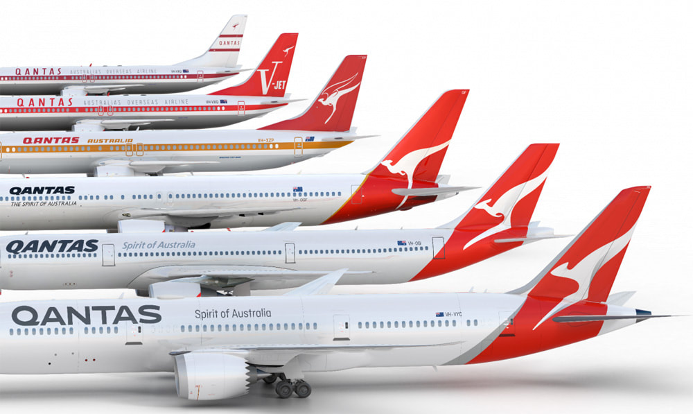
What's new with the logo you make ask? Well the main font or logotype has been significantly changed to be longer and more streamlined. The kangaroo icon has been given a new shape and shading to add dimension.
Some argue that this is now more of an abstract kangaroo - if you look at it and didnt know it was a 'roo, would you guess the animal?
Qantas is such an iconic logo that my personal feel is that people will look at the new logo but not really notice any differences. It is what it is... a recognisable and dependable Australian classic.

 RSS Feed